


Illuminating letters: behind the scenes
Let's get into the ugly side of illustrating

Dear reader,
I’ve shared a good chunk of my process in behind the scenes posts, from my planning on paper to turning stories into zines, but there is something I haven’t shared.
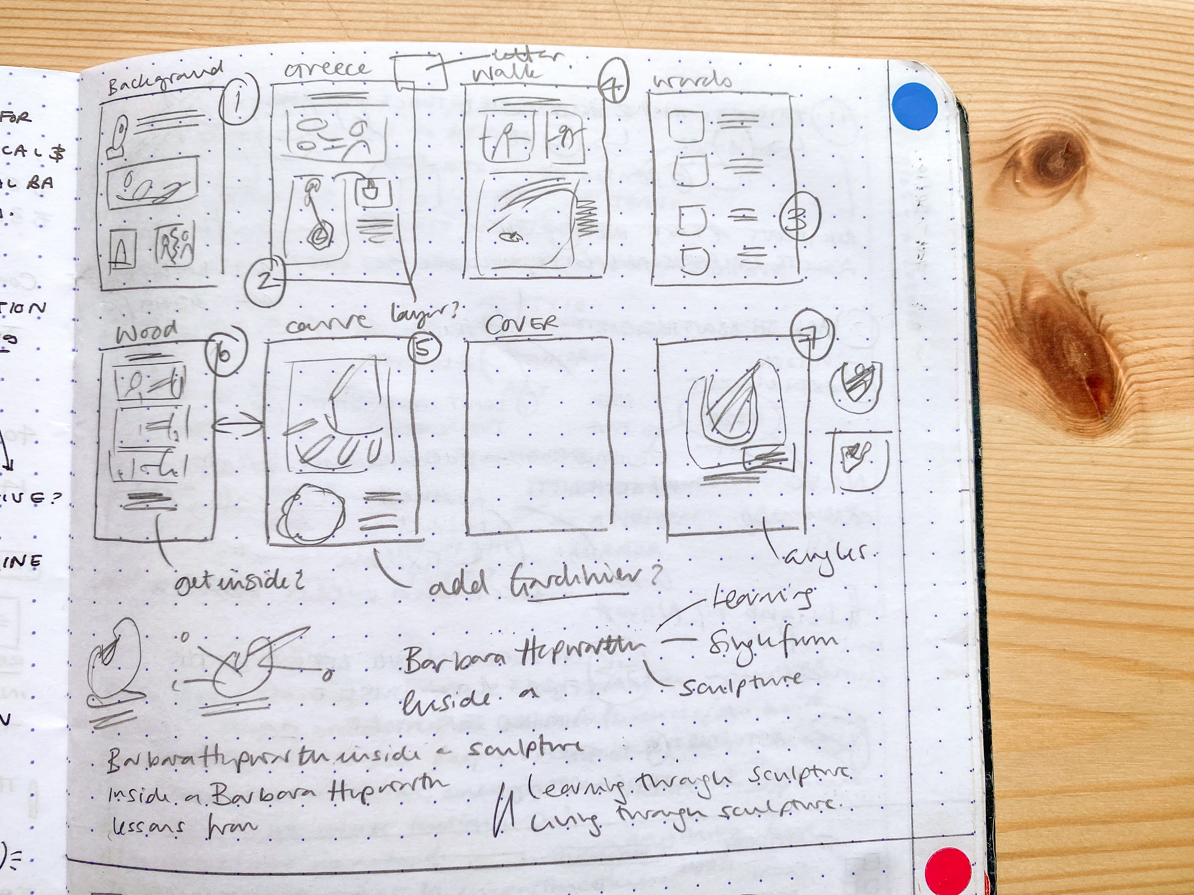
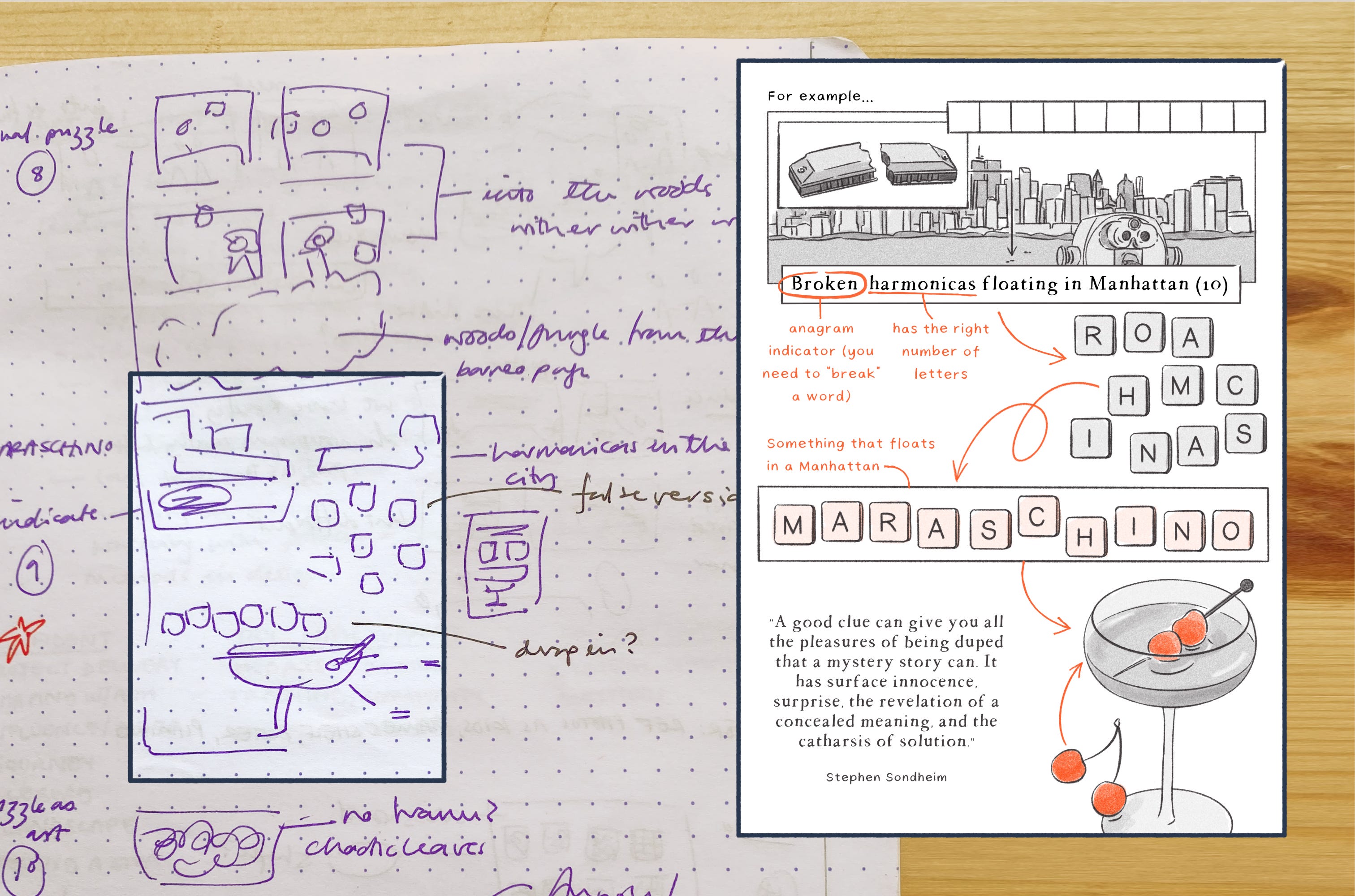
Ugly thumbnails.
Okay, ugly is in the eye of the beholder. But these tiny images are purposefully not pretty, because they’re all about supporting my process. I have to let them be as messy as they need to let me play with the ideas. For me they’re the first stage between having a concept and turning it into an illustration.
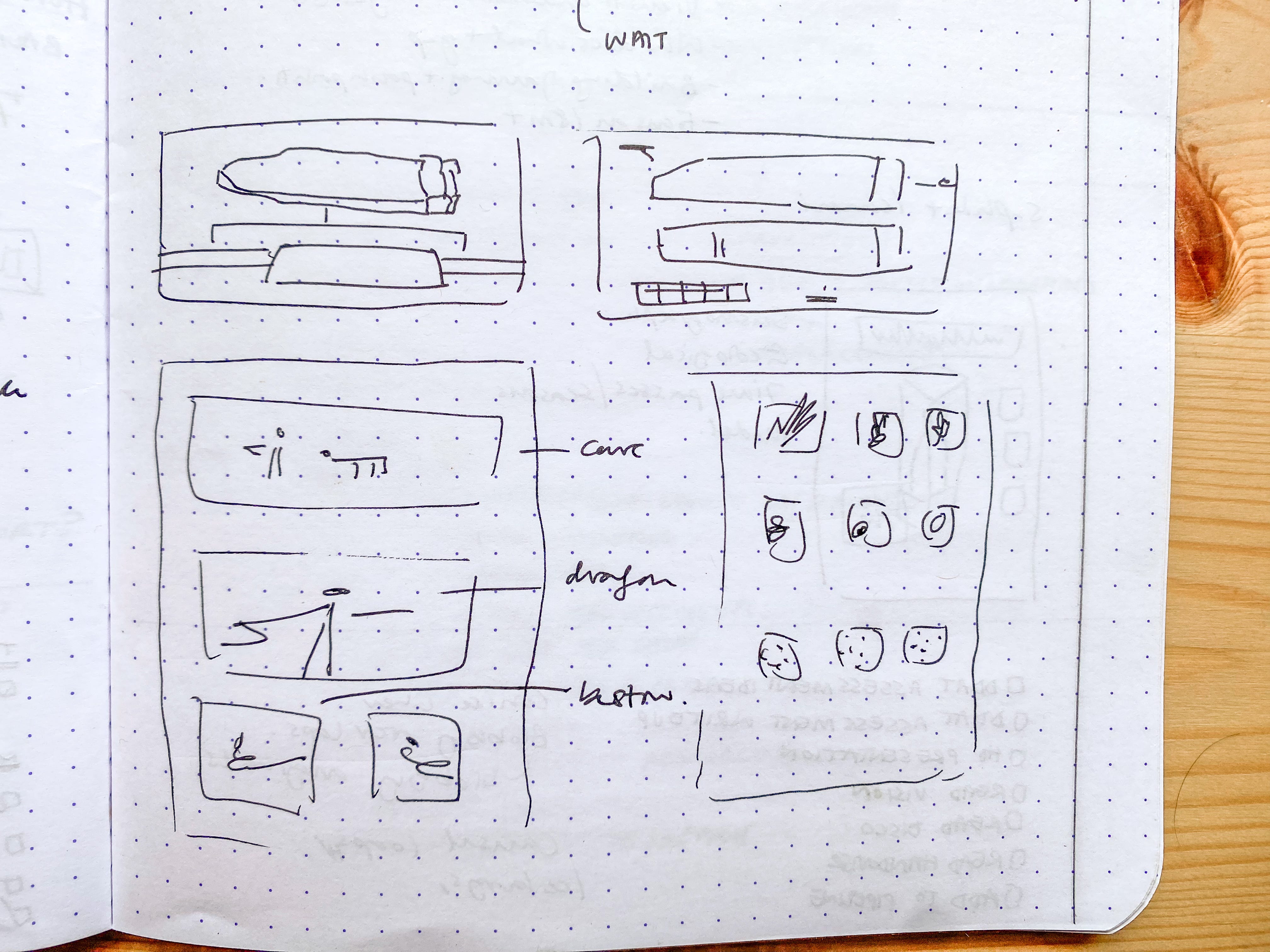
They started as a tool to generate ideas for my client work, they’re not the “rough” sketches I send over because I know they make no sense. They’re a way to play with layout and get my ideas out of my head to make room for more. They’re usually just vague shapes of the pieces I want to pull together, a visual version of shorthand notes.

I make ugly thumbnails for most newsletter pages too. Points if you can tell which stories these became.
Sometimes those tiny sketches become full layouts and sometimes they don’t go anywhere. But I always make better work for having made them.
So here’s to the ugly thumbnails. Maybe they’re beautiful in their own way after all.
See you soon with something powered by tiny sketches,
Natalie
They're beautiful! And I love how only you can make sense of them and know exactly what you want it to turn into ❤️
It's nice to see an artist's process from beginning to end. Thanks for sharing.